Posts

New Summer Range - 'Marina'

Image
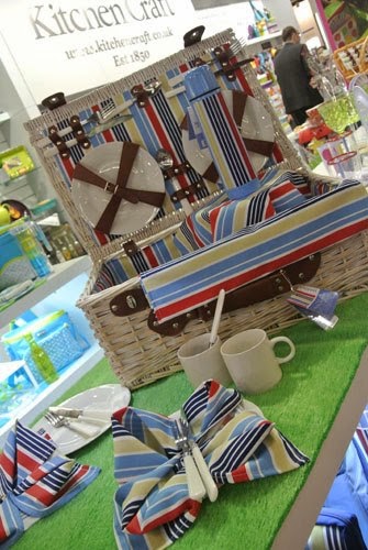
The first of my new summer ranges for the Cool Movers brand is called 'Marina'. The brief was to create a nautical style stripe pattern and to build the range to reflect this theme. Although the remit was to keep things simple I still had fun with the odd nautical touch such as rope handles on the picnic bags!  Products in the range include melamine cups, bowls, plates and paper napkins, along with a variety of picnic bags, baskets and rugs.  Find out more here. Images copyright Kitchen Craft 2013.
Show time!!! - Ambiente (Frankfurt)

Image
Following on from their exhibition at the Spring Fair earlier this month, Kitchen Craft took my new ranges international when they exhibited at Messe Frankfurt at the Ambiente 2013 trade show! It's very exciting to think of my designs being shown in another country ready to be exported around the world!!! Images copyright Kitchen Craft 2013.

Show time!!! - Spring Fair

Image
Earlier this month I was lucky enough to visit Spring Fair 2013, which is an annual exhibition at the NEC showcasing new products across many genres from greetings cards and gifts, to toys, stationery, homeware and kitchen products. It was a great few days seeing all the products that will appear in UK stores over the next 12 months and I was delighted that Kitchen Craft were there exhibiting a number of new ranges I have designed for them. Photographs aren't permitted in the exhibition, but exhibitors are allowed to photograph their own stands, so these images are taken from the Kitchen Craft Facebook page. Above is a sneaky peak at three new summer ranges designed for the Cool Movers brand and below is an exclusive look at my new Christmas design! More to come on all of these ranges later in the year!!! Images copyright Kitchen Craft 2013.

Splashing about with paint!

Image
I've been very busy over the last few months working on a variety of new designs for products that will be released in 2013. I was particularly delighted when it transpired that for several of the briefs I would need to get my paint-brushes out! I haven't painted for quite some time, but got back into it really quickly. The cats and dogs shown aren't among the designs chosen by the client, but I quite liked them, so thought I would turn them into a brand new pattern just for fun! It was an absolute treat painting cats, as they are my favourite animal - such beautiful creatures with very individual personalities! As well as the cats and dogs, I also painted some other animals as part of the brief and these will be revealed later in the year! 

Revisited: Wedding photos (Part 2)

Image
We also wanted our wedding breakfast to be extremely personal and to reflect our personalities. For me that of course was all about colour and pattern! I loved the idea of creating a village fair / country kitchen vintage style with florals and polka dots and subtle clashes that somehow just went together! My wonderful Nan made the table cloths, we bought crockery from charity shops and used mismatched paper napkins by the amazing  Cath Kidston to create the effect.  To make it even more personal to us and to keep with the country theme, we named each table after chicken breeds, which included breeds of chickens that we were keeping in our garden at the time. (Although, sadly since the wedding we have lost our lovely chickens to a fox :( ) I created the above designs as table markers, as well as the below wedding favour, which was printed on special flower seed paper and linked to the wedding stationery from earlier in the day to give eac...

Revisited: Wedding photos (Part 1)

Image
I've had a lovely long Christmas break and have taken the opportunity to have a good sort out of my studio! I was delighted when I came across a memory card with some photos that I thought were lost! They are from the day before my wedding a year and a half ago and it was always my intention to share them with you. The first set of images were taken in the barn where I got married and show the order of service and reserved seating cards I designed. Those of you who have visited my blog for a while will recognise that they match the 'save the date' card and invitations from my  previous post. Until I looked at these photos I had forgotten just how much work went into planning a wedding. We wanted it to be very personal, so spent a lot of time creating elements to make it atmospheric. For example, the floral screens to the left of the image above were actually pieces of garden trellis, which we painted, hung fabric behind and hinged together, before threading t...

HAPPY NEW YEAR!

Image
Happy 2013 everybody! And with the start of the new year I have decided to add a new banner to the blog to bring it up to date with my new branding! Over the coming year I have a variety of exciting new projects to show you - some of which will feature this updated branding, so I hope you like it! The banner also contains contact information, so please do continue to send me emails and tweets! I have decided to keep my floral border though, as this will be featuring on new products for VYD in 2013 - keep checking back if you want to find out more! (A screen shot with the old banner is above).