Posts

Showing posts with the label beer

Show time!!! - Ambiente (Frankfurt)

Image
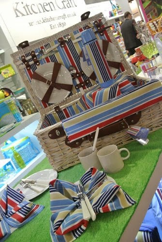
Following on from their exhibition at the Spring Fair earlier this month, Kitchen Craft took my new ranges international when they exhibited at Messe Frankfurt at the Ambiente 2013 trade show! It's very exciting to think of my designs being shown in another country ready to be exported around the world!!! Images copyright Kitchen Craft 2013.

LOCK IN (Part 2)

Image
The logo plays an important part in the 'Lock In' range being used as part of the repeat print, stand alone on products such as the bottle beer glass shown above (- this product always makes me smile!) and also on packaging. Therefore I wanted it to be visually strong and to form a decorative image in it's own right. Hopefully, the Victorian padlock in place of the  letter 'O' works as quite a masculine image, while simultaneously reinforcing the idea of tradition.  Products available include beer mats, beer runners, neoprene can and bottle coolers, where the repeat design can be seen in entirety...  There is also a large tray, which I think shows off the design to very good effect! As you can see from the beer glass at the top of this post there was room to have a bit of fun with this range and one product that I really love is the key corkscrew and bottle opener, which was inspired by my key illustration within the repeat desig

NEW PRODUCTS - 'LOCK IN' (Part 1)

Image
You may recall from an earlier post that I teased you with a photo of a new range of products for Bar Craft, called 'Lock In' . I am so pleased to now be able to show you the whole range! The brief I was given was to create a design for a male gift range that would be evocative of traditional pub imagery for use on bar associated products. As the pub is a very British phenomenon, I decided to use the British bulldog as my main motif with pub imagery such as bar stools, beer barrels and beer glasses to support this. I wanted to keep the illustrations very strong in line-work, (as can be seen in the beer mats above) to create a style with a modern twist on traditional etching. The idea of a 'Lock In' at home is further reinforced with lock and key imagery and a strong typographic layout using words associated with beer. Colour also played an important part, as I chose creams and bronzes to emulate the rich amber colours of beer, complimen