LOCK IN (Part 2)
The logo plays an important part in the 'Lock In' range being used as part of the repeat print, stand alone on products such as the bottle beer glass shown above (- this product always makes me smile!) and also on packaging. Therefore I wanted it to be visually strong and to form a decorative image in it's own right. Hopefully, the Victorian padlock in place of the letter 'O' works as quite a masculine image, while simultaneously reinforcing the idea of tradition.
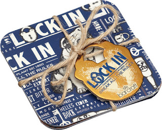
Products available include beer mats, beer runners, neoprene can and bottle coolers, where the repeat design can be seen in entirety...
There is also a large tray, which I think shows off the design to very good effect!
As you can see from the beer glass at the top of this post there was room to have a bit of fun with this range and one product that I really love is the key corkscrew and bottle opener, which was inspired by my key illustration within the repeat design and brought to life by the fantastic 3D designers at Kitchen Craft. With the corkscrew hidden inside the 'key', it's very clever, practical and would make a unique gift!
I was also very pleased that the design was used to form the packaging for this range. I talked to the amazing packaging artworkers at Kitchen Craft about keeping the packaging very masculine in terms of materials, such as corrugated card and rough twine. I think they did a fantastic job interpreting this into swing tags and really like how they have used the repeat print to form backing cards and inserts to compliment the products!
Images copyright Kitchen Craft 2012.


Comments
Post a Comment