Posts

Showing posts with the label drawings

Happy 4th of July!

Image
A little video of me doodling for all my friends in the USA, including my agents, Jewel Branding & Licensing . Have a wonderful day! Music by bensound.com

Revisited: Wedding photos (Part 2)

Image
We also wanted our wedding breakfast to be extremely personal and to reflect our personalities. For me that of course was all about colour and pattern! I loved the idea of creating a village fair / country kitchen vintage style with florals and polka dots and subtle clashes that somehow just went together! My wonderful Nan made the table cloths, we bought crockery from charity shops and used mismatched paper napkins by the amazing  Cath Kidston to create the effect.  To make it even more personal to us and to keep with the country theme, we named each table after chicken breeds, which included breeds of chickens that we were keeping in our garden at the time. (Although, sadly since the wedding we have lost our lovely chickens to a fox :( ) I created the above designs as table markers, as well as the below wedding favour, which was printed on special flower seed paper and linked to the wedding stationery from earlier in the day to give each of our

Revisited: Wedding photos (Part 1)

Image
I've had a lovely long Christmas break and have taken the opportunity to have a good sort out of my studio! I was delighted when I came across a memory card with some photos that I thought were lost! They are from the day before my wedding a year and a half ago and it was always my intention to share them with you. The first set of images were taken in the barn where I got married and show the order of service and reserved seating cards I designed. Those of you who have visited my blog for a while will recognise that they match the 'save the date' card and invitations from my  previous post. Until I looked at these photos I had forgotten just how much work went into planning a wedding. We wanted it to be very personal, so spent a lot of time creating elements to make it atmospheric. For example, the floral screens to the left of the image above were actually pieces of garden trellis, which we painted, hung fabric behind and hinged together, before threading t

MIX IT (Part 3)

Image
As we head towards the festive season, thoughts are really beginning to turn towards Christmas parties and New Year, so this is a perfect time for my final post about my party range design for ' Mix It' , which would make a perfect fun alternative to traditional Christmas party products!  One of my favourite things about this range is the packaging, which was put together by the very clever  artworkers at Kitchen Craft. They took my illustrations and surface patterns and all of the playfulness that I tried to create on product and extended this onto boxes, labels and belly bands to really bring the range together! I particularly love how they have subtly brought my cross-hatch surface pattern into the packaging using a spot UV finish, (which is basically a varnish effect on a matt background).  There are lots of cocktail and party products available in the 'Mix It' range. For more details click here. Images copyright Kitchen Craft 2012. 

MIX IT (Part 2)

Image
The second part of the 'Mix It' brief was to design a complimentary surface pattern that would go with the illustrations, but be separate to them. This needed to be unisex to go across a range of textile and paper product, so I decided to keep it quite simple with a hand drawn cross hatch effect created with a dip pen. I used the acidic colours from the illustrations to pull the two contrasting looks together. The cross-hatch design is available on neoprene bottle bags, bottle coolers and napkins. Images copyright Kitchen Craft 2012.

MIX IT (Part 1)

Image
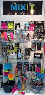
In addition to 'Lock In', I was asked to design a second range for the Bar Craft brand, which is now known as 'Mix It' . The brief for this range was to create a fun and playful design for a cocktail / party range that would appeal to young adults. There were two parts to the brief. The first part was to create illustrations of products / objects associated with cocktail making, which were to be used on packaging and some of the products. I wanted to create a strong, yet playful look, so turned to my trusty dip pen and ink to create a set of fluid drawings. I love 'accidental' mark making, so embraced all the ink splatters and smudging that tend to form with this type of illustration. This can be seen to best effect on the cocktail coasters, which come in a set of four. I really took these as the starting point for the whole range, using my favourite vibrant and acidic colours to set the party tone! Images copyright Kitchen Cra

LOCK IN (Part 2)

Image
The logo plays an important part in the 'Lock In' range being used as part of the repeat print, stand alone on products such as the bottle beer glass shown above (- this product always makes me smile!) and also on packaging. Therefore I wanted it to be visually strong and to form a decorative image in it's own right. Hopefully, the Victorian padlock in place of the  letter 'O' works as quite a masculine image, while simultaneously reinforcing the idea of tradition.  Products available include beer mats, beer runners, neoprene can and bottle coolers, where the repeat design can be seen in entirety...  There is also a large tray, which I think shows off the design to very good effect! As you can see from the beer glass at the top of this post there was room to have a bit of fun with this range and one product that I really love is the key corkscrew and bottle opener, which was inspired by my key illustration within the repeat desig

NEW PRODUCTS - 'LOCK IN' (Part 1)

Image
You may recall from an earlier post that I teased you with a photo of a new range of products for Bar Craft, called 'Lock In' . I am so pleased to now be able to show you the whole range! The brief I was given was to create a design for a male gift range that would be evocative of traditional pub imagery for use on bar associated products. As the pub is a very British phenomenon, I decided to use the British bulldog as my main motif with pub imagery such as bar stools, beer barrels and beer glasses to support this. I wanted to keep the illustrations very strong in line-work, (as can be seen in the beer mats above) to create a style with a modern twist on traditional etching. The idea of a 'Lock In' at home is further reinforced with lock and key imagery and a strong typographic layout using words associated with beer. Colour also played an important part, as I chose creams and bronzes to emulate the rich amber colours of beer, complimen