Posts

Showing posts with the label products

New Summer Range - 'Sherbert'

Image
The second of my new summer ranges for the Cool Movers brand is called 'Sherbert'. Again, this brief was to create a spot and stripe pattern that was bright and bold, but very simple for mass market appeal. There are a variety of different cool bags, picnic baskets and rugs available in the designs.  There is even a paper lantern to add some summertime cheer to your garden! If you like the design you can also buy it on melamine cups, plates, bowls and a tray, as well as paper napkins. Images copyright Kitchen Craft 2013.

Show time!!! - Spring Fair

Image
Earlier this month I was lucky enough to visit Spring Fair 2013, which is an annual exhibition at the NEC showcasing new products across many genres from greetings cards and gifts, to toys, stationery, homeware and kitchen products. It was a great few days seeing all the products that will appear in UK stores over the next 12 months and I was delighted that Kitchen Craft were there exhibiting a number of new ranges I have designed for them. Photographs aren't permitted in the exhibition, but exhibitors are allowed to photograph their own stands, so these images are taken from the Kitchen Craft Facebook page. Above is a sneaky peak at three new summer ranges designed for the Cool Movers brand and below is an exclusive look at my new Christmas design! More to come on all of these ranges later in the year!!! Images copyright Kitchen Craft 2013.

HAPPY NEW YEAR!

Image
Happy 2013 everybody! And with the start of the new year I have decided to add a new banner to the blog to bring it up to date with my new branding! Over the coming year I have a variety of exciting new projects to show you - some of which will feature this updated branding, so I hope you like it! The banner also contains contact information, so please do continue to send me emails and tweets! I have decided to keep my floral border though, as this will be featuring on new products for VYD in 2013 - keep checking back if you want to find out more! (A screen shot with the old banner is above).

MIX IT (Part 3)

Image
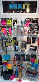
As we head towards the festive season, thoughts are really beginning to turn towards Christmas parties and New Year, so this is a perfect time for my final post about my party range design for ' Mix It' , which would make a perfect fun alternative to traditional Christmas party products!  One of my favourite things about this range is the packaging, which was put together by the very clever  artworkers at Kitchen Craft. They took my illustrations and surface patterns and all of the playfulness that I tried to create on product and extended this onto boxes, labels and belly bands to really bring the range together! I particularly love how they have subtly brought my cross-hatch surface pattern into the packaging using a spot UV finish, (which is basically a varnish effect on a matt background).  There are lots of cocktail and party products available in the 'Mix It' range. For more details click here. Images copyright Kitchen Craft 2012. 

MIX IT (Part 2)

Image
The second part of the 'Mix It' brief was to design a complimentary surface pattern that would go with the illustrations, but be separate to them. This needed to be unisex to go across a range of textile and paper product, so I decided to keep it quite simple with a hand drawn cross hatch effect created with a dip pen. I used the acidic colours from the illustrations to pull the two contrasting looks together. The cross-hatch design is available on neoprene bottle bags, bottle coolers and napkins. Images copyright Kitchen Craft 2012.

MIX IT (Part 1)

Image
In addition to 'Lock In', I was asked to design a second range for the Bar Craft brand, which is now known as 'Mix It' . The brief for this range was to create a fun and playful design for a cocktail / party range that would appeal to young adults. There were two parts to the brief. The first part was to create illustrations of products / objects associated with cocktail making, which were to be used on packaging and some of the products. I wanted to create a strong, yet playful look, so turned to my trusty dip pen and ink to create a set of fluid drawings. I love 'accidental' mark making, so embraced all the ink splatters and smudging that tend to form with this type of illustration. This can be seen to best effect on the cocktail coasters, which come in a set of four. I really took these as the starting point for the whole range, using my favourite vibrant and acidic colours to set the party tone! Images copyright Kitchen Cra

LOCK IN (Part 2)

Image
The logo plays an important part in the 'Lock In' range being used as part of the repeat print, stand alone on products such as the bottle beer glass shown above (- this product always makes me smile!) and also on packaging. Therefore I wanted it to be visually strong and to form a decorative image in it's own right. Hopefully, the Victorian padlock in place of the  letter 'O' works as quite a masculine image, while simultaneously reinforcing the idea of tradition.  Products available include beer mats, beer runners, neoprene can and bottle coolers, where the repeat design can be seen in entirety...  There is also a large tray, which I think shows off the design to very good effect! As you can see from the beer glass at the top of this post there was room to have a bit of fun with this range and one product that I really love is the key corkscrew and bottle opener, which was inspired by my key illustration within the repeat desig