Posts

MIX IT (Part 3)

Image
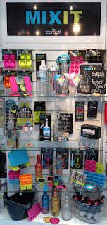
As we head towards the festive season, thoughts are really beginning to turn towards Christmas parties and New Year, so this is a perfect time for my final post about my party range design for ' Mix It' , which would make a perfect fun alternative to traditional Christmas party products!  One of my favourite things about this range is the packaging, which was put together by the very clever  artworkers at Kitchen Craft. They took my illustrations and surface patterns and all of the playfulness that I tried to create on product and extended this onto boxes, labels and belly bands to really bring the range together! I particularly love how they have subtly brought my cross-hatch surface pattern into the packaging using a spot UV finish, (which is basically a varnish effect on a matt background).  There are lots of cocktail and party products available in the 'Mix It' range. For more details click here. Images copyright Kitchen Craft 2012. ...

MIX IT (Part 2)

Image
The second part of the 'Mix It' brief was to design a complimentary surface pattern that would go with the illustrations, but be separate to them. This needed to be unisex to go across a range of textile and paper product, so I decided to keep it quite simple with a hand drawn cross hatch effect created with a dip pen. I used the acidic colours from the illustrations to pull the two contrasting looks together. The cross-hatch design is available on neoprene bottle bags, bottle coolers and napkins. Images copyright Kitchen Craft 2012.

MIX IT (Part 1)

Image
In addition to 'Lock In', I was asked to design a second range for the Bar Craft brand, which is now known as 'Mix It' . The brief for this range was to create a fun and playful design for a cocktail / party range that would appeal to young adults. There were two parts to the brief. The first part was to create illustrations of products / objects associated with cocktail making, which were to be used on packaging and some of the products. I wanted to create a strong, yet playful look, so turned to my trusty dip pen and ink to create a set of fluid drawings. I love 'accidental' mark making, so embraced all the ink splatters and smudging that tend to form with this type of illustration. This can be seen to best effect on the cocktail coasters, which come in a set of four. I really took these as the starting point for the whole range, using my favourite vibrant and acidic colours to set the party tone! Images copyright Kitchen Cra...

LOCK IN (Part 2)

Image
The logo plays an important part in the 'Lock In' range being used as part of the repeat print, stand alone on products such as the bottle beer glass shown above (- this product always makes me smile!) and also on packaging. Therefore I wanted it to be visually strong and to form a decorative image in it's own right. Hopefully, the Victorian padlock in place of the  letter 'O' works as quite a masculine image, while simultaneously reinforcing the idea of tradition.  Products available include beer mats, beer runners, neoprene can and bottle coolers, where the repeat design can be seen in entirety...  There is also a large tray, which I think shows off the design to very good effect! As you can see from the beer glass at the top of this post there was room to have a bit of fun with this range and one product that I really love is the key corkscrew and bottle opener, which was inspired by my key illustration within the repeat desig...

NEW PRODUCTS - 'LOCK IN' (Part 1)

Image
You may recall from an earlier post that I teased you with a photo of a new range of products for Bar Craft, called 'Lock In' . I am so pleased to now be able to show you the whole range! The brief I was given was to create a design for a male gift range that would be evocative of traditional pub imagery for use on bar associated products. As the pub is a very British phenomenon, I decided to use the British bulldog as my main motif with pub imagery such as bar stools, beer barrels and beer glasses to support this. I wanted to keep the illustrations very strong in line-work, (as can be seen in the beer mats above) to create a style with a modern twist on traditional etching. The idea of a 'Lock In' at home is further reinforced with lock and key imagery and a strong typographic layout using words associated with beer. Colour also played an important part, as I chose creams and bronzes to emulate the rich amber colours of beer, complimen...

A BIG THANK YOU...

Image
...to everyone who took part in my 'virtual coffee morning' for Macmillan ! I am very pleased to announce that it has raised £240, which is a huge £300 including gift aid! Considering I only came up with the idea a couple of days before the event was launched I think it has been a huge success and I am so grateful to everyone who bought 'cakes' and posted the links on their social networking pages! This money will go towards helping Macmillan help to improve the lives of people with cancer.

'Virtual Coffee Morning' for Macmillan

Image
On the 28 September Macmillan cancer support is holding it’s annual fundraising event – ‘The world’s biggest coffee morning.’ Support for cancer sufferers is a cause very close to my heart. Like so many people I have lost family members to cancer – and thankfully, I have family members who have survived cancer. I also have first hand experience of the disease as around 20 months ago I was diagnosed with a form of Leukaemia known as CML. Since diagnosis I have been on a clinical trial and am extremely lucky, because due to medication and the support I receive from family and friends I am predominantly able to get on with my life without major disruption at the moment. However it’s a long haul and I understand that for cancer sufferers the future is often uncertain…I spend a lot of time in the cancer care unit at my local hospital and see the impact that cancer has on people’s lives    – Thankfully Macmillan is there to provide practical, medical and financial support when c...