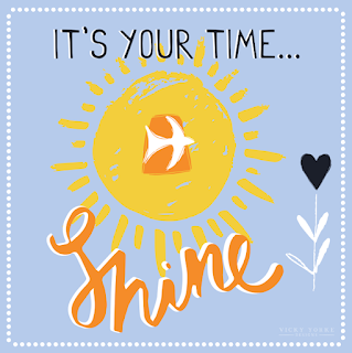
My Design Process - 'Something Special'
As a designer I often get asked how I create my images and if I draw everything by hand. I thought it might be fun to answer these questions in this blog post to give you a quick overview of the process of how I work to create my designs.
At the moment I'm working on a new range of greetings cards, which is something a bit different for me... but the process for each design is similar to how I work for creating all surface pattern designs or placement graphics for products. The starting point is always an idea. Sometimes this comes in the form of a client brief and sometimes it's the spark of an idea in my head. For these greetings cards I decided I wanted to create a range of cards based on my existing typography range, 'Well Hello There!', but with sentiments that were more focussed on the greetings card market. Often at this stage I create an ideas board, but because the look of the new range is to follow existing designs I simply reviewed the existing work as shown above and researched the greetings market. After making a list of possible different sentiments to include in my new range I set to work in my sketchbook...
So do I draw everything by hand? - The answer is yes! Every design I create starts out as a doodle or a sketch. Normally I will roughly mark designs out in pencil working out the layout / composition... I like to have fun with typography letting my imagination run wild to draw whatever letter shapes pop into my head. I also love geometrics and these often creep into my compositions!
Then once I am happy I outline everything using my trusty fineliner pens! I like to create wonky lines as I feel these give my designs texture and character, so I use a very fine nib, but go back over the lines several times before block filling large areas with a Sharpie and adding any extra detail the design requires.
At this stage I transfer the design from my sketchbook to my computer to work it up into final artwork. Once in Adobe Illustrator I use the 'Live Trace' function, which converts my drawing into a fully scalable vector file, which is ideal for factories to work from because it can be easily re-sized to fit any product without losing any of my original detail, or the warm appeal of my original hand drawn image. It is also an ideal format for me to add colour.
I can quickly and easily try out different colour pallets until I find the one that best suits my design. I love to use bright and vibrant colour combinations that really make my designs stand out! For this range I decided to use the same pallet as 'Well Hello There!', but I have mixed the colours together differently within each piece to create a range that has a real colour pop!
When I have chosen a colour pallet I am happy with I can set to work colouring each element of the design individually.
This is also a perfect time to add in extra textures. I love to create a slight distressed look to my artwork and often use a textured background grid as part of my signature style. This stage takes time and patience, but because I use pantone colours it means that my finished artwork not only looks fun and appealing, but all my designs are factory ready, which makes things much easier for manufacturers when it comes to using my designs across different products for production.
When I am happy that the design is ready, my final stage is to create a mock-up visual in Adobe Photoshop of how the design will look as a product ready for presentation.
This card celebrates moving house and is part of my brand new range called 'Something Special'.
If you are an art director / manufacturer who would like to review my portfolio please contact my agents, Jewel Branding & Licensing for further information.
(Beth Franklin - beth@jewelbranding.com)


Comments
Post a Comment